Visual Journalism
- Laboratory of Information Design, Iuav University in Venice
- Professor Katerina Dolejsova
- Date February 2013
- Collaborators Laura Dal Bo’, Marina Mangiat, Luca Migliore
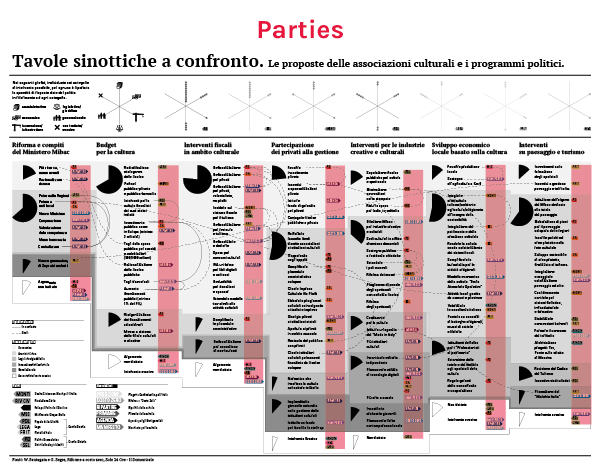
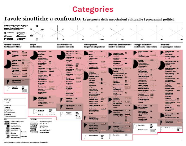
This infographic was made to display programs of all the party competing in occasion of 2013 italian political election and proposals made by cultural associations. Datas are taken from a serie of questionnaires collected by the business newspaper “Il Sole 24 Ore” but in this work they have been re-organized and visually designed in order to confront them from different points of view.
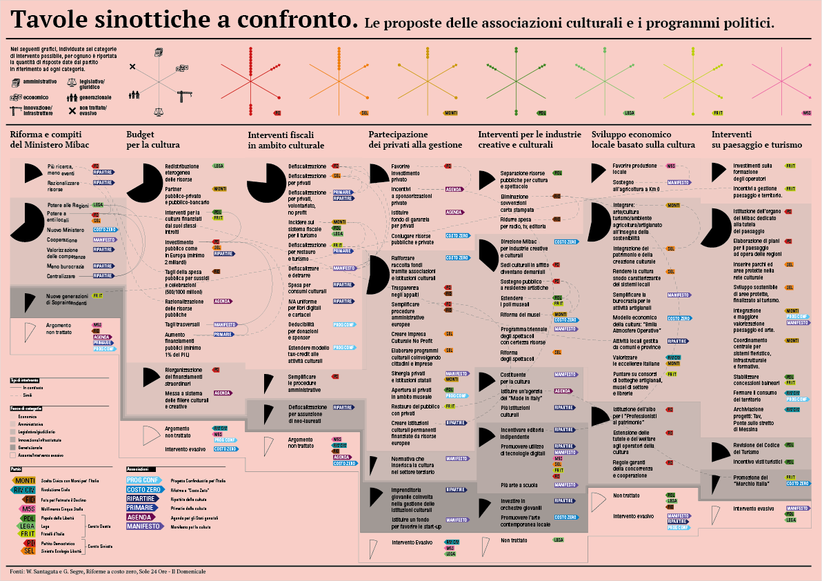
The project is designed to fit in the A3 format in order to be printed comfortably, for a calm reading, from your office printer.
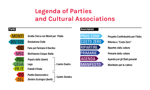
In the whole infographic parties and cultural associations are detectable by name and color.
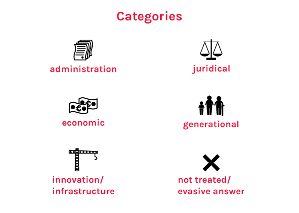
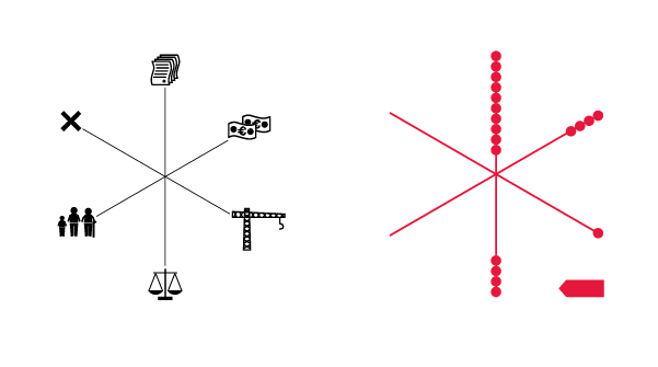
In the upper part of the graphics you can see the Categories.
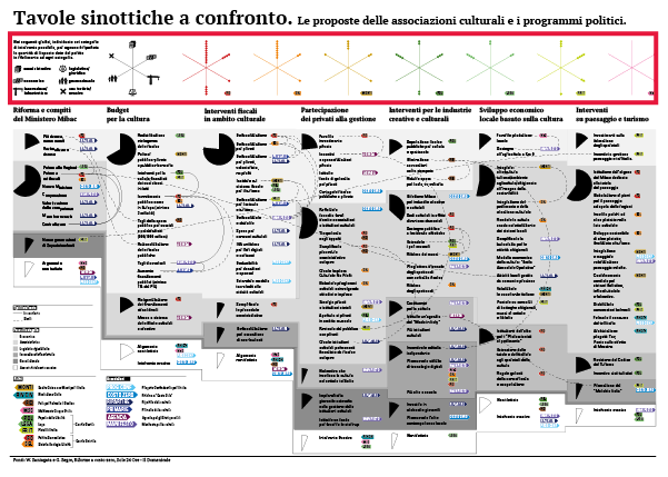
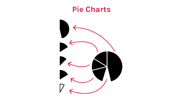
They are used in the asterisk graphics to show the number of answers each party has given in each category.
You can read the lower part of the infographic following different point of views:
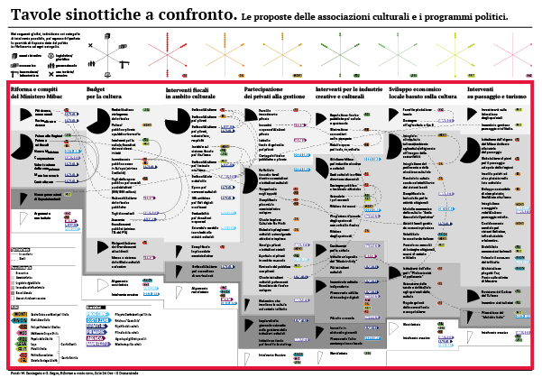
Vertical columns are questions followed up by their answers. Pie charts shows in percentage the number of answers given for every categories of topic.
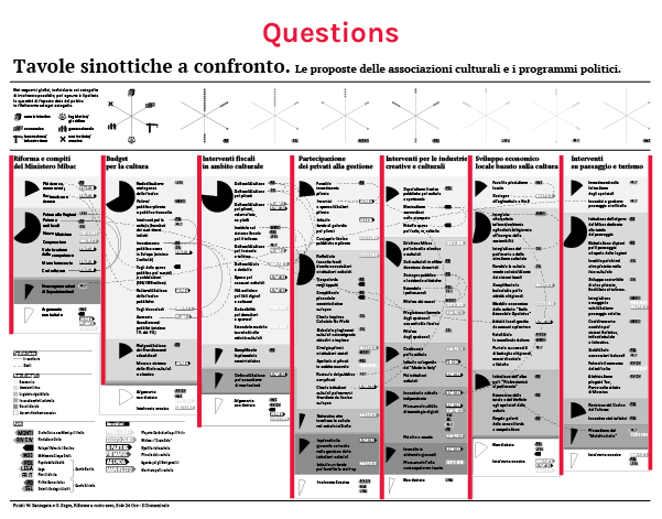
You can read all answers of the same categories in the same scale-of-gray area.
You can found similarities in answers by following the continuous lines, or contrast by dotted lines.
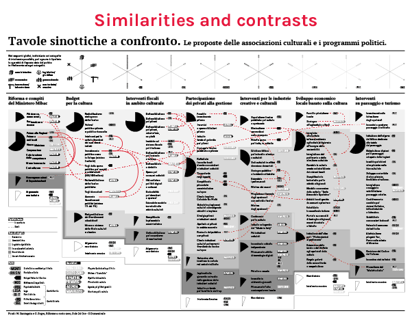
Or you can look only for answer and informations related to your favorite party looking for its colorful flags.